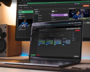
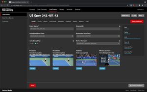
Uplynk Live Events
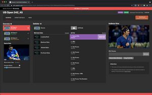
Uplynk is a video streaming service. We were purchased by Verizon a few years back, and I currently work for them full time. One of the services provided by Uplynk is to manage live events. You can create, edit, and manage all your live events. Then, on the Live Event Dashboard, you can run your event. You can tell the event to go to an ad break, come back from the ad break, display slate, and much more. Here, we are going to talk specifically about the dashboard.
Team Project
- 1 Project Manager
- 1 Backend Engineer
- 1 Frontend Engineer
- 1 UX/UI Engineer (Me)
Info
- Web App
- Desktop
- Mobile Friendly
Setting up a live event
Purpose and Goal
There is a lot that goes into running a live event. You need to test your incoming video feed to make sure it is working correctly. You need to switch your event to show ads at the correct time, and then bring back the live feed when ready. You may need to quickly go to slate if there is an emergency. In short, there are a lot of things that need the operator's attention at any given time. We needed to make sure that the operator could easily navigate around the app to do what was needed, yet pull their attention to something specific if something was going wrong.
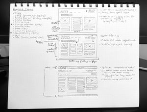
Ealry sketches of the layout
Problems and Thought Process
Problems
- It became apparent that there were two main areas fighting for the operator's attention. The first was the health of the event. For a live event, health means that the stream itself is or is not lagging. Most of the time, the event will be healthy, and the user won’t need to think about health. If health does change, it needs to be the top priority of the operator. The other is the state of the event. Is the event in an ad break? Are we playing the pre-event slate? Are we showing the regular video feed? The user needs to know what state the event is in at all times and be able to switch the state around quickly.
Thought Process
- After testing a few ideas on future users of the application we found that placing colored bars at the top and the bottom could denote health. When in a healthy state (most of the time) they didn’t notice it much. Once it changed, however, it immediately pulled their attention from watching the different views. It tugged at their peripheral vision. This allowed us to use other transitions and colors to portray the status change (live, ad-break, slate) of the event. In short most of their attention was in the middle of the page but if we triggered a big color change at the edges it was noticed immediately.
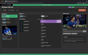
Everything is fine. This event is proceeding nicely.
Whoa! I need to switch to a backup feed!
Current Status
A new internal group was formed to run live events for customers that couldn't run their events. This team consists of about 50 people, and they run around 200 events per day. They run many more when there is a lot of live sports going on. They use this dashboard daily and have had a positive experience. We get to hear from them about improvements they would like to see. The dashboard is evolving and will continue to expand. When it launched we even won an award for the "Best of Show" at NAB. Yay!

Lessons Learned
Input from a lot of different places got the Live Event Dashboard launched. While I was the UX person and I wrote all the code for the interface there were many good UX and layout ideas from the project manager and other engineers. It is important to involve them early and often and not dismiss ideas until you hear them in full. There were quite a few conversations I thought were going to lead to a dead-end, but once discussed, turned out to be a great solution.